


Kamden Bailey
Staff Writer
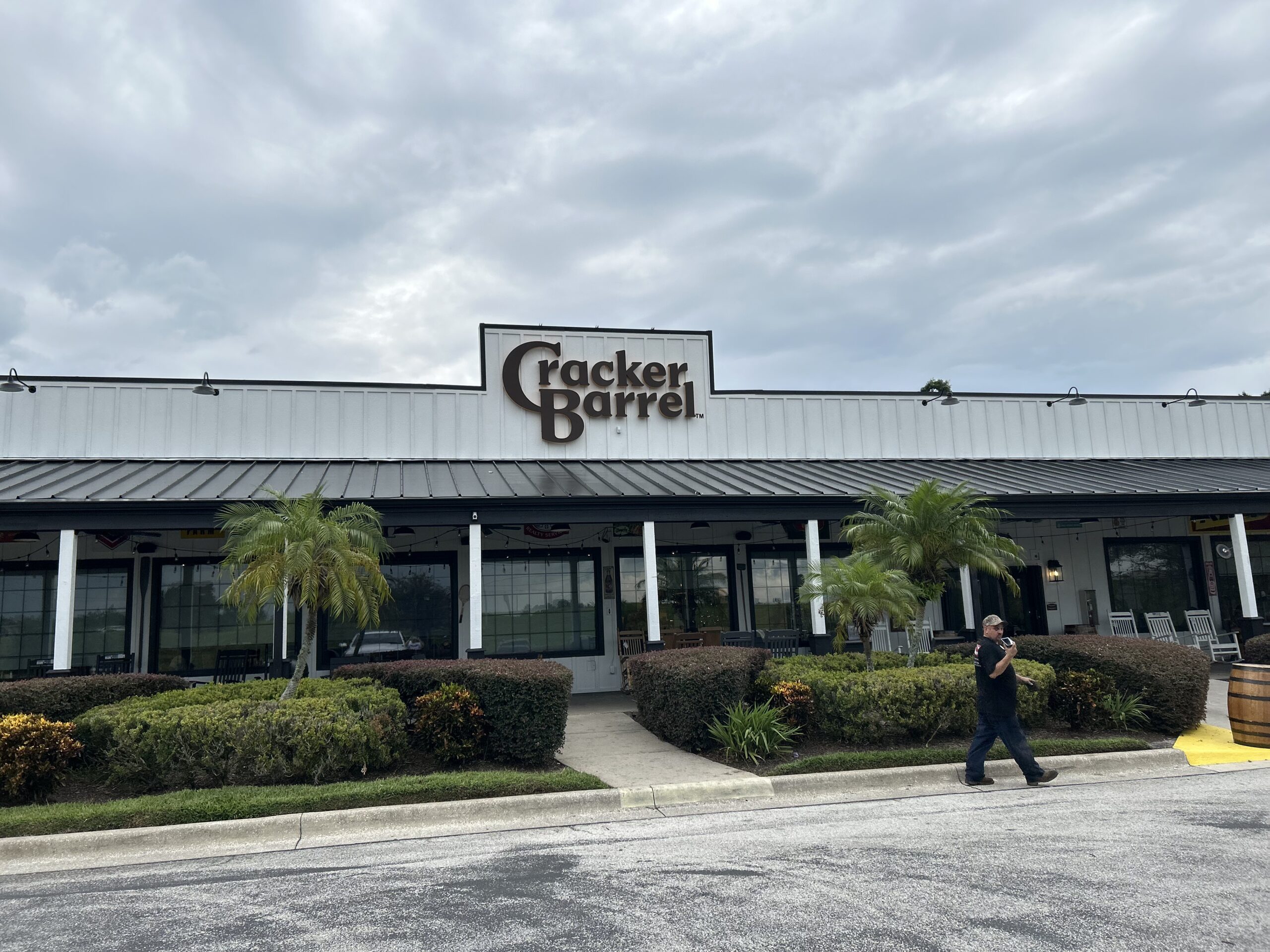
On Aug. 19, famous country rustic style restaurant Cracker Barrel became another casualty in the trend of minimalist logo redesigns. Minimalist logos, despite being the current fad for logos in recent years, are just bland and boring, especially when you compare them to their older counterparts that have more elaborate details and life.
The old Cracker Barrel logo featured founder Dan Evins’ real uncle and, according to their website, the restaurant’s “goodwill ambassador” Uncle Herschel sitting next to a literal barrel of crackers. This logo has become synonymous with the brand and perfectly represents the old-fashion feel of the restaurant. The new logo strips away Uncle Herschel and the barrel, replacing them with a bland yellow square with the most basic looking text that reads “Cracker Barrel” smacked on top of it.


In response to the public outcry, Cracker Barrel backpedaled on their redesign plans and released a statement on Instagram saying, “Thankfully our return policy applies to logos.”
I, like most people, hate unnecessary change. A good iconic logo can make or break a company’s success, which is why I believe Cracker Barrel changed back to their original logo. An article published by CBS news reported on the nearly $100 million loss of market share following the recent logo change.
An example of a more successful logo change would be when Pepsi changed their logo in March 2023. In an article published to the marketing news site Campaign, it was explained that Pepsi’s logo redesign was modeled after the brand’s look from the 60s, 80s and 90s. I believe they did this to elicit nostalgia from their dedicated long-term customers, which helps contribute to creating a more recognizable brand and, in turn, more profits. Companies are known for their original values and extracting that brand’s identity takes away from the company, in more ways than one.
A logo change, if approached correctly, can yield a beneficial outcome for a business’ profits in the long run. It’s a good way of showing that a company is capable of keeping up with their competition and is able to maintain cultural relevance.
In Oct. 2024, Walmart made a seemingly insignificant change to their iconic logo that gave them a refreshing new look. They tweaked the yellow and blue to be a bit deeper and rounded out the edges of their “spark” icon.

These minor changes were influenced by the study of color psychology, which asserts that certain colors can make you feel certain emotions. An article published by the psychology and mental health platform Verywell Mind reported that out of 4,600 people from 30 different countries, “35% linked blue to feelings of relief” and “52% felt that yellow means joy.”
I believe that logos are at their best when they are recognizable. Humans are creatures of habit, so a drastic redesign can oftentimes lead to dissatisfaction from customers who may find satisfaction somewhere else. Companies should stick to the images they have built up for decades instead of hopping on the ban wagon of simple and plain logos. A good logo is a timeless logo.


